Color trends come and go with remarkable speed, yet every once in a while a shade emerges that feels less like a temporary trend and more like a lasting transformation in design culture. Greige is one of those rare colors. Over the past decade, it has steadily become one of the most influential and widely discussed shades in interior design, architecture, home décor, furniture styling, and even fashion. People searching for “greige” are often trying to understand what makes this color so unique, why designers recommend it so frequently, and how it became one of the defining neutral tones of modern aesthetics.
At first glance, greige may appear simple because it blends gray and beige together. However, the growing popularity of greige goes far beyond basic color mixing. Its appeal is deeply connected to the way modern lifestyles, emotional preferences, and design philosophies have evolved. Today’s homeowners and designers increasingly seek environments that feel calm, balanced, elegant, warm, and timeless rather than overly dramatic or trend-dependent. Greige perfectly captures this emotional balance by combining the cool sophistication of gray with the warmth and softness of beige.
Another reason greige has become so popular is because people are moving away from extreme interior trends that quickly feel outdated. Years ago, ultra-beige interiors dominated homes before cool gray palettes became fashionable. Eventually, many homeowners realized that entirely gray spaces sometimes felt too cold and sterile, while heavily beige rooms occasionally appeared dated or overly traditional. Greige emerged as the perfect middle ground because it delivers warmth without feeling yellow and sophistication without feeling harsh.
Modern interior design also places increasing importance on emotional comfort. Homes today are expected to feel peaceful, welcoming, and adaptable because people spend more time indoors than ever before. The rise of remote work, digital lifestyles, and open-concept living has changed how individuals experience their spaces emotionally. Greige fits perfectly into this modern mindset because it creates an atmosphere that feels calming, flexible, and naturally elegant.
The influence of greige has expanded beyond walls and paint colors as well. Designers now use greige in furniture, flooring, kitchen cabinetry, textiles, fashion collections, and architectural styling because it complements nearly every design aesthetic. Whether paired with minimalist Scandinavian décor, modern luxury interiors, rustic farmhouse elements, or contemporary urban spaces, greige adapts effortlessly.
This article explores the meaning of greige, its psychological appeal, why it became so influential in modern design, how to use it effectively in interiors, its role in fashion and architecture, common mistakes people make when decorating with it, and why this versatile neutral continues shaping contemporary style around the world.
What Is Greige?
Greige is a neutral color created by blending gray and beige together. The name itself combines the words “gray” and “beige,” reflecting its balanced appearance between cool and warm tones. While this definition sounds simple, greige is actually one of the most nuanced and versatile colors in modern design because its exact appearance can vary dramatically depending on lighting, surrounding materials, undertones, and texture.
Some greige shades lean more heavily toward gray, creating cooler and more contemporary aesthetics, while others contain stronger beige or taupe influences that make spaces feel warmer and softer. This flexibility is one of the biggest reasons why designers appreciate greige so much. It adapts beautifully to different environments without appearing too cold, too yellow, too stark, or too overpowering.
Another important characteristic of greige is its ability to respond differently throughout the day. Natural sunlight, artificial lighting, room orientation, flooring colors, and surrounding décor all influence how greige appears visually. In bright daylight, some greige shades may look airy and soft gray, while in warm evening lighting they can appear richer and more beige.
This dynamic quality gives greige a sense of depth and sophistication that many standard neutral colors lack. Unlike flat white or simple gray tones, greige often feels layered and emotionally balanced. It creates visual softness without sacrificing elegance.
Another reason greige became so popular is because it solves common decorating challenges. Pure gray interiors sometimes feel cold or industrial, especially in homes lacking natural warmth. Traditional beige spaces, on the other hand, can occasionally appear outdated or overly yellow depending on lighting conditions. Greige eliminates many of these problems by offering a more modern and adaptable neutral foundation.
Designers also appreciate greige because it pairs exceptionally well with other colors. It complements black accents, white trim, natural wood textures, earthy palettes, muted blues, greens, metallic finishes, and soft fabrics without competing for attention.
The popularity of greige reflects broader cultural preferences for balance, calmness, and timeless design. Rather than demanding attention aggressively, greige supports spaces quietly while allowing furniture, texture, lighting, and architecture to stand out naturally.
Why Greige Became So Popular
The rise of greige did not happen accidentally. Its popularity reflects major shifts in design philosophy, lifestyle preferences, and emotional aesthetics over the past decade. Modern homeowners increasingly want interiors that feel timeless, adaptable, and emotionally calming rather than heavily trend-focused.
One major reason greige became so influential is because people grew tired of extreme interior color trends. During the early 2000s, beige dominated home design almost completely. Later, cool gray interiors became extremely fashionable because they felt sleek and modern. However, many homeowners eventually realized that fully gray interiors sometimes lacked warmth and emotional comfort.
Greige emerged as the ideal compromise. It delivered the modern sophistication of gray while preserving the warmth and softness people still wanted in their living spaces. This balance helped greige appeal to both contemporary and traditional design preferences simultaneously.
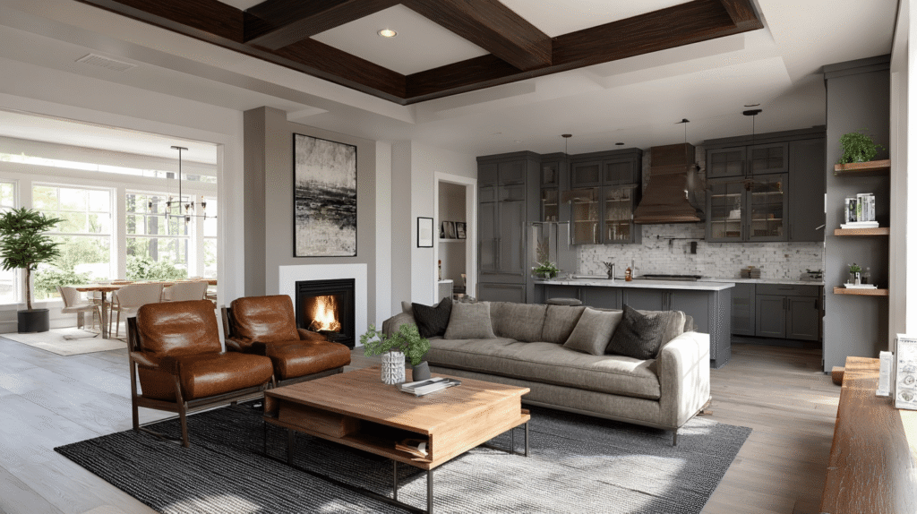
Another factor behind greige’s popularity is its incredible versatility. Modern homes often combine multiple design styles within one space. Open floor plans connect kitchens, dining rooms, and living areas visually, requiring colors that flow naturally throughout the home. Greige works exceptionally well in these environments because it adapts easily across different rooms and materials.
Social media and interior design platforms also accelerated greige’s popularity. Homeowners increasingly seek interiors that photograph beautifully while still feeling livable and inviting. Greige performs especially well visually because it creates soft contrast, subtle sophistication, and natural harmony in photographs.
Another important reason involves emotional psychology. Neutral tones strongly influence mood and atmosphere within interiors. Harsh colors can feel overstimulating, while overly cold palettes may seem emotionally distant. Greige creates calmness and visual softness that many people associate with comfort and relaxation.
The rise of minimalist and Scandinavian-inspired design also contributed significantly to greige’s influence. These styles prioritize simplicity, natural light, organic textures, and understated elegance. Greige complements these principles perfectly because it feels clean without appearing sterile.
Real estate trends further increased greige’s appeal. Realtors and home stagers frequently recommend greige because it appeals to a wide range of buyers. Homes painted in balanced neutral tones often feel more spacious, modern, and move-in ready.
Ultimately, greige became popular because it reflects what modern audiences increasingly value: balance, flexibility, emotional comfort, and timeless elegance.
The Psychological Effect of Greige
Color psychology plays a powerful role in how people experience spaces emotionally, and greige has become especially popular because of the emotional atmosphere it creates. Modern homeowners are increasingly aware that interior colors influence stress levels, comfort, focus, relaxation, and overall mood.
Greige creates a calming psychological effect because it sits comfortably between warm and cool tones. Gray traditionally represents sophistication, stability, and modernity, while beige conveys warmth, softness, and comfort. By combining these qualities, greige creates emotional balance that feels peaceful and grounded.
Another reason greige feels emotionally appealing is because it avoids visual aggression. Bright colors or highly contrasting palettes can sometimes feel overwhelming over long periods of time. Neutral tones allow the eyes and mind to relax more naturally, which is especially important in homes where people spend significant amounts of time working, resting, or socializing.
The rise of wellness-focused interior design has also contributed to greige’s popularity. Many modern homeowners want interiors that reduce stress and support mental well-being. Soft neutral palettes often create environments that feel quieter, safer, and more emotionally restorative.
Greige also works exceptionally well with natural light, which strongly affects emotional perception within interiors. Sunlight interacting with soft greige walls creates warmth and subtle depth without harsh contrast.
Another psychological advantage of greige is flexibility. People often feel more emotionally comfortable in spaces that can evolve over time without requiring complete redesign. Because greige pairs with so many materials and accent colors, homeowners can update furniture or décor without changing foundational wall colors constantly.
The emotional neutrality of greige also encourages personalization. Unlike highly dominant colors that control the visual atmosphere completely, greige creates a supportive background allowing textures, artwork, furniture, and personal details to stand out naturally.
This emotional adaptability is one reason greige continues remaining relevant while many design trends fade quickly.
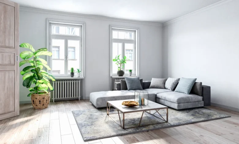
How to Use Greige in Interior Design
Using greige successfully requires understanding undertones, lighting, texture, and balance. Although greige is versatile, its appearance changes significantly depending on surrounding elements.
One of the most important factors is lighting. Natural light dramatically affects how greige appears throughout the day. North-facing rooms often emphasize cooler gray undertones, while south-facing spaces may highlight warmer beige elements. Testing paint samples under different lighting conditions is essential before committing to a shade.
Another important aspect involves pairing greige with complementary textures. Greige works beautifully alongside natural wood, linen fabrics, stone surfaces, brushed metals, and soft textiles because these materials enhance its warmth and depth.
In modern interiors, greige often serves as a foundational wall color supporting minimalist aesthetics. White trim, black accents, warm wood flooring, and layered textiles create elegant contrast without overwhelming the space.
Greige also works exceptionally well in kitchens. Many homeowners now choose greige cabinetry because it feels softer than stark gray while remaining more modern than traditional cream or tan cabinets.
Bedrooms benefit from greige because the color naturally creates a relaxing atmosphere. Layering different neutral tones through bedding, curtains, and rugs adds depth without disrupting calmness.
Another popular application involves open-concept living spaces. Because greige adapts easily between warm and cool décor styles, it creates visual continuity across connected rooms.
Accent colors paired with greige can dramatically influence mood. Muted blues, olive greens, charcoal, terracotta, and soft blush tones all complement greige beautifully depending on desired style direction.
Texture is especially important when decorating with neutral palettes. Without layered materials and varied surfaces, greige interiors can sometimes appear flat. Mixing woven fabrics, matte finishes, natural wood grains, and subtle metallic details helps create richness and visual interest.
Common Mistakes When Decorating With Greige
Although greige is highly versatile, people sometimes make decorating mistakes that reduce its effectiveness. One common issue involves ignoring undertones. Some greige shades lean pink, purple, green, or yellow depending on composition and lighting. Choosing the wrong undertone can create unexpected visual clashes.
Another mistake is using overly flat lighting. Poor lighting can make greige appear dull or muddy instead of elegant and layered. Combining natural light with warm artificial lighting usually creates the best results.
Many homeowners also forget the importance of contrast. Entirely greige rooms without variation may feel monotonous or lifeless. Contrast through textures, accent colors, wood tones, or black details helps create depth.
Overusing cool gray elements alongside greige can also create imbalance. Since greige already contains gray undertones, excessive cool materials may make spaces feel colder than intended.
Another common mistake is neglecting texture. Neutral interiors depend heavily on material variation to maintain visual interest.
Understanding balance and layering helps greige interiors feel sophisticated rather than overly plain.
Greige Beyond Interior Design
Although greige became especially popular in interiors, its influence now extends into fashion, architecture, furniture design, and lifestyle branding. Fashion designers frequently use greige because it conveys understated elegance and versatility.
Greige clothing often feels timeless because it pairs easily with both casual and formal styles. Luxury fashion brands especially favor muted neutral palettes because they communicate sophistication without relying on bold colors.
Architecture has also embraced greige extensively. Modern buildings often use greige stone, concrete, stucco, or exterior paint because the color blends naturally with urban and natural environments simultaneously.
Furniture companies increasingly produce greige upholstery, rugs, and décor pieces because consumers prefer adaptable neutral aesthetics.
The broader popularity of greige reflects cultural movement toward subtle luxury, emotional comfort, and timeless design rather than flashy trend-driven styling.
Why Greige Remains Timeless
Many color trends disappear quickly because they rely heavily on novelty or extreme visual impact. Greige remains timeless because it is rooted in emotional balance and versatility rather than temporary fashion.
Neutral colors historically maintain long-term popularity because they adapt to changing styles and personal preferences more easily than bold trend colors. Greige specifically succeeds because it balances warmth and coolness simultaneously.
Another reason greige endures is because it complements evolving design movements naturally. Whether paired with minimalist, rustic, industrial, Scandinavian, or luxury aesthetics, greige continues feeling relevant.
Its emotional softness also contributes to longevity. Spaces designed around calmness and comfort tend to remain appealing longer than highly dramatic interiors.
Ultimately, greige represents modern design priorities perfectly: balance, sophistication, flexibility, and emotional warmth.
Conclusion
Greige has become far more than a passing interior design trend. It represents a broader shift toward balanced living, emotional comfort, timeless elegance, and adaptable style within modern homes and lifestyles. By combining the sophistication of gray with the warmth of beige, greige creates environments that feel calm, welcoming, and visually refined without appearing cold or outdated.
Its growing popularity reflects changing preferences in how people experience their spaces emotionally. Modern homeowners increasingly want interiors that support relaxation, flexibility, and long-term beauty rather than short-lived trends or overpowering visual statements.
Greige’s versatility also makes it one of the most practical neutral tones available today. Whether used in walls, cabinetry, furniture, architecture, or fashion, it adapts naturally across different styles and environments while maintaining understated sophistication.
As design trends continue evolving, greige remains relevant because it is grounded in timeless principles rather than temporary novelty. It creates harmony instead of visual competition, allowing textures, materials, lighting, and personal style to shine naturally.
Ultimately, the enduring appeal of greige lies in its ability to make spaces feel balanced, modern, and emotionally inviting all at once. That rare combination is exactly why this subtle yet powerful color continues shaping contemporary design around the world.
Frequently Asked Questions
What color is greige?
Greige is a neutral color created by blending gray and beige together for a balanced warm-cool appearance.
Why is greige so popular in interior design?
Greige became popular because it combines modern sophistication with warmth, making spaces feel elegant yet comfortable.
Does greige work with all design styles?
Yes, greige works well with modern, Scandinavian, farmhouse, minimalist, rustic, and luxury interior styles.
Is greige better than gray or beige?
Many people prefer greige because it balances the coolness of gray with the warmth of beige more naturally.
What colors pair best with greige?
Greige pairs beautifully with white, black, wood tones, muted blues, olive greens, soft blush, and earthy colors.
Can greige make a room look larger?
Yes, lighter greige shades can create a spacious and airy appearance while maintaining warmth and softness.
Why does greige look different in various lighting?
Lighting affects undertones within greige, causing it to appear warmer or cooler depending on natural and artificial light conditions.
Read More: